Distinctive identity
Credible in their sector, distinct from their peers
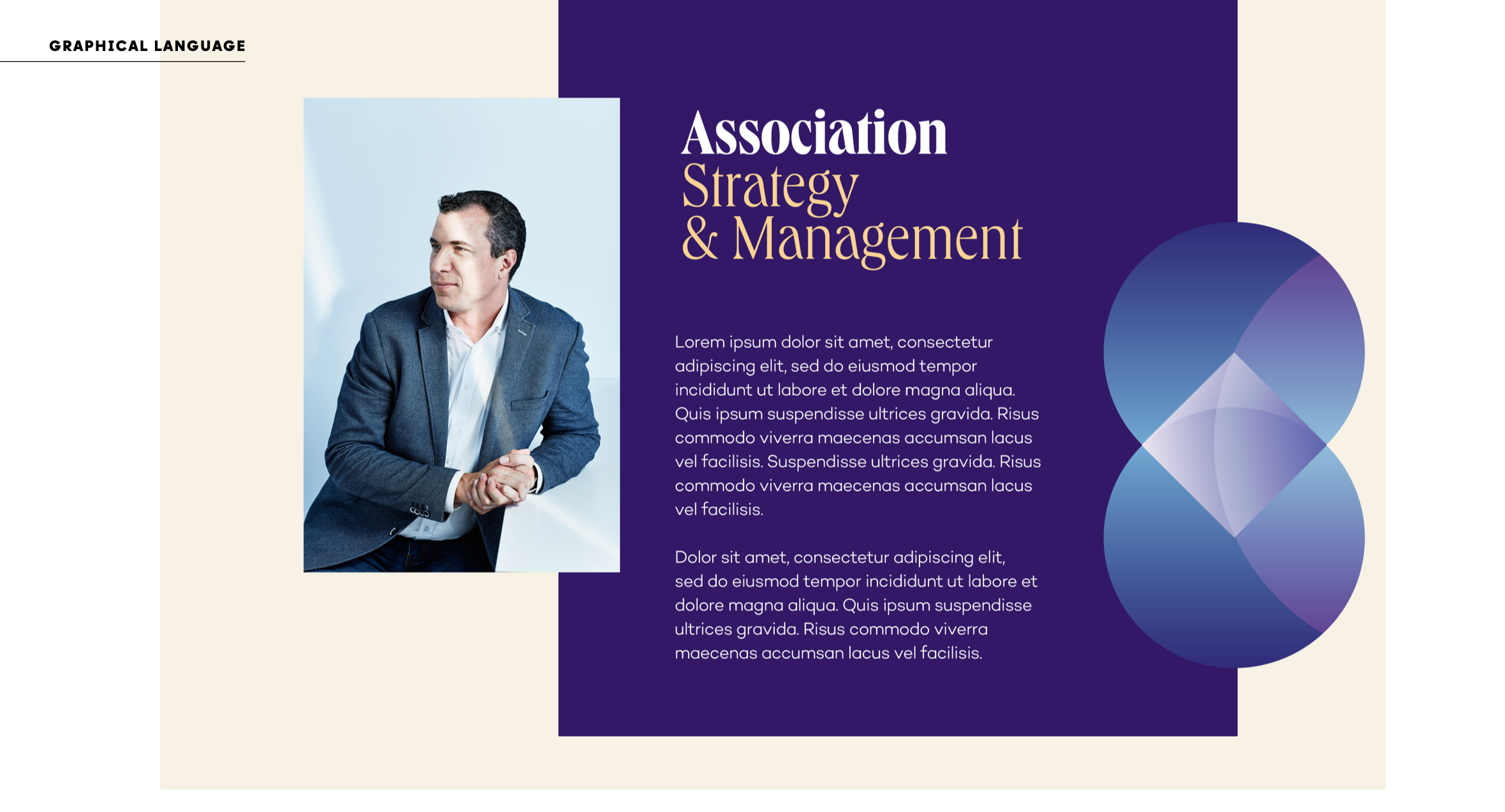
Applied everywhere
From brand identity to site and proposals — one consistent thread
Exempla Management & Consulting helps content- and community-driven international associations advance their missions — strategy, management and the events that bring their members together. Their existing presence didn't reflect that level of expertise, and their services were hard to read for the different audiences they serve: association staff, volunteer leaders and wider communities.
The brief had a built-in tension: the new identity had to feel credible within the codes of their sector, yet stand clearly apart from look-alike consultancies. Fit in — without blending in.
We ran the project in two phases: first defining an impactful identity, then applying it across the touchpoints that carry Exempla's image. One continuous thread, from the brand key through to the page and the proposal.
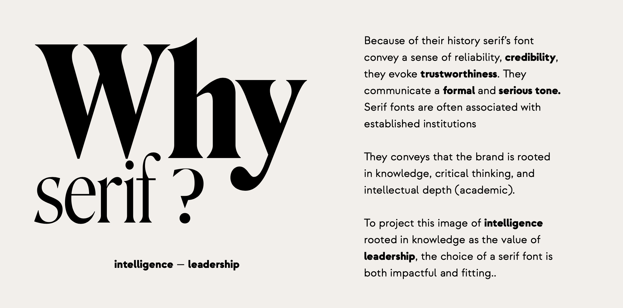
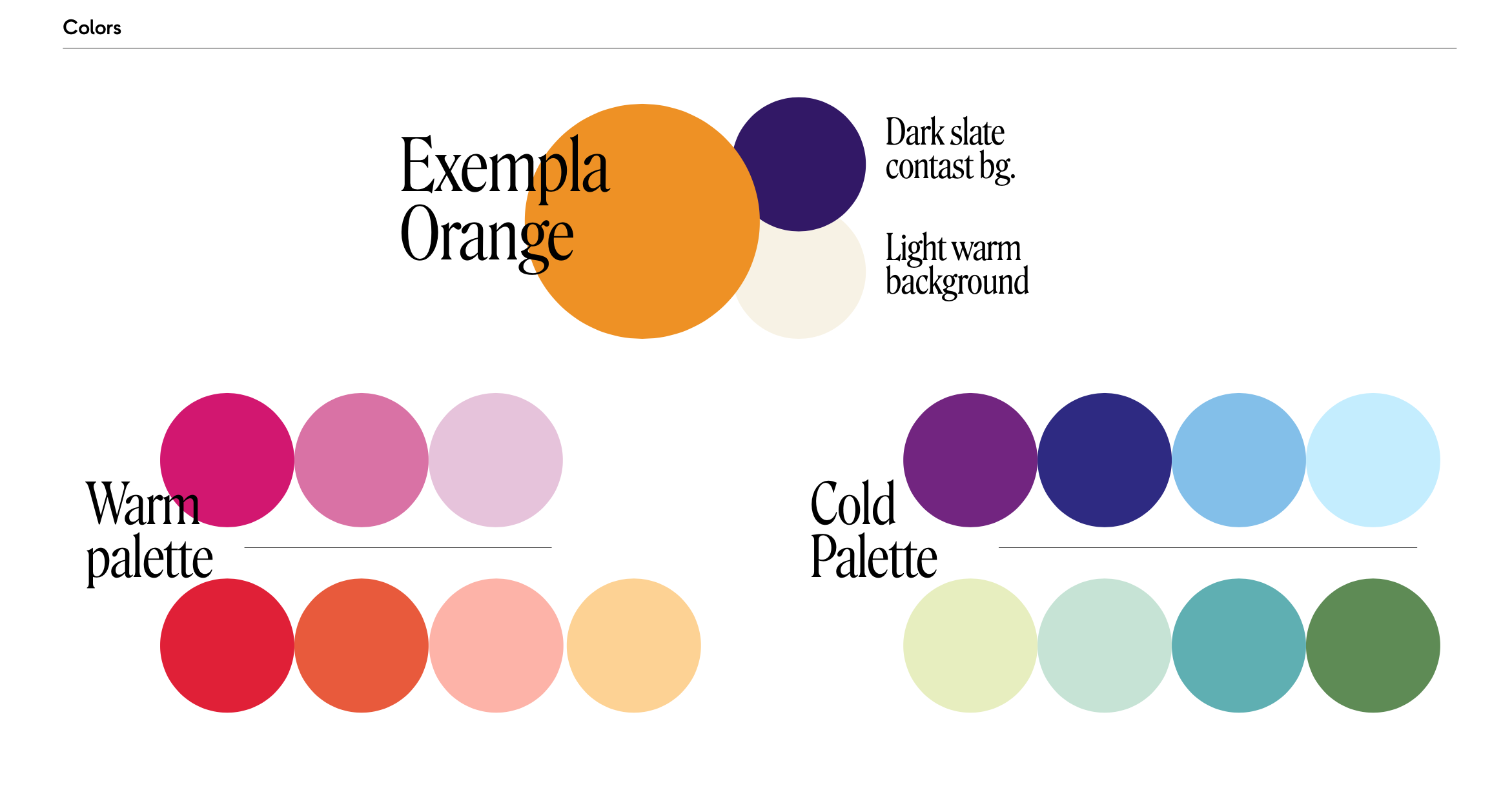
We started from who Exempla actually is. A kick-off session to surface their DNA, core values and the visual codes of their sector. A competitor scan to map the minimum standards needed to stay credible — and, more importantly, the white space where Exempla could differentiate. From there we built the brand key (differentiation, rational value, emotional value) and a moodboard that modernised the brand without forcing a full rebrand.
Every choice traces back to what Exempla does: bring people together.
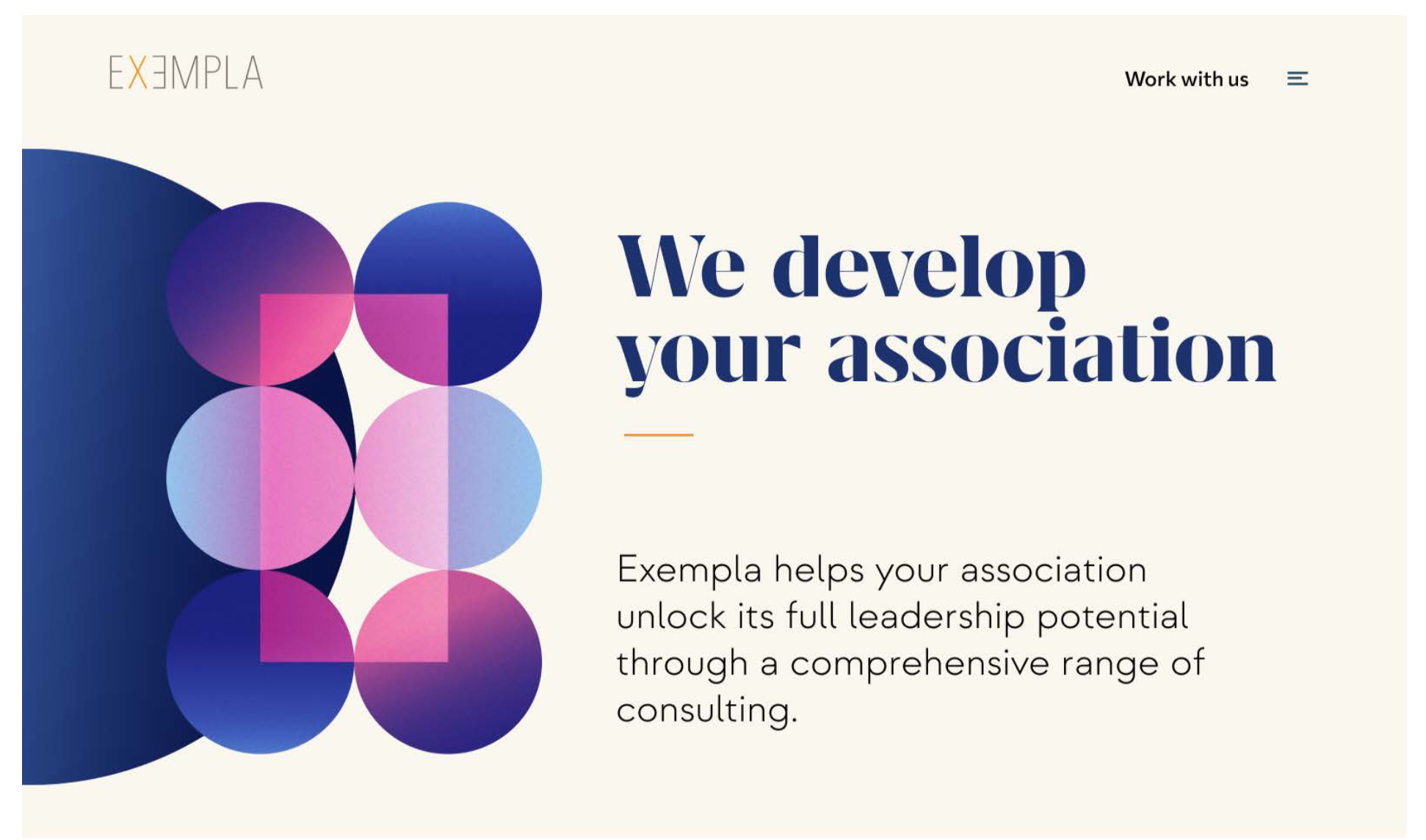
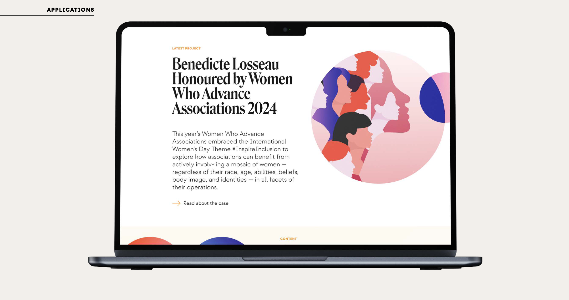
An identity only works if it shows up where the brand is judged. For Exempla, that's two things above all: the website, and the proposals they send to win event mandates. So we applied the system to both.
On the website, we restructured how services are presented — making it clear how they combine to serve different types of association clients — and delivered clear, detailed wireframes the webmaster could implement directly, with minimal interpretation. For their proposals and RFPs, we built a PowerPoint template carrying the same circles, type and colour system, so every pitch to a prospective client looks unmistakably Exempla. The two biggest reflections of their image now pull in the same direction.

An identity that reads as native to their sector while standing clearly apart from it — built on a symbol that says exactly what Exempla does. From the brand key to the website and the proposals that win the work, every element pulls in the same direction, giving Exempla a presence their team can own and extend.
Ready when you are
30 minutes. No pitch deck. Just an honest conversation about where you are and where you want to go.